Solar panel analysis pt 2: Temperature & efficiency
Intro
In a previous post in this series I explored the patterns in a solar panel data set. It turned out the panels can warm up to a hot 47°C. The negative effect of temperature on the efficiency of solar panels is well known and documented. Generally, panels are expected to perform optimal up to 25°C, when panels get hotter than this a maximal power output penalty is paid. For my panels the producer claims this penalty is 0.408% of the maximal power (1820 W) per degree Celsius above 25°C. So for 47°C this would equal (47 - 25) * 0.408% = 9% less power (1656 W). In this post we’ll see if we can find a temperature effect in our data set and whether we can validate the manufacturer’s claim.
Once again we load the data and look at the last 6 rows.
library(rprojroot)
library(tidyverse)
library(lubridate)
rt <- rprojroot::is_rstudio_project

solar_df <- read_csv2(rt$find_file("static/files/solar_power.csv"))%>%
  # the times in the raw dataset have CET/CEST timezones
  # by default they will be read as UTC
  # we undo this by forcing the correct timezone
  # (without changing the times)
  mutate(timestamp = force_tz(timestamp, tzone = 'CET'))%>%
  # Since we don't want summer vs winter hour differences
  # we now transform to UTC and add one hour.
  # This puts all hours in CET winter time
  mutate(timestamp = with_tz(timestamp, tzone = 'UTC') + 3600)

kable(tail(solar_df), align = 'c', format = 'html')| timestamp | temperature | power |
|---|---|---|
| 2017-10-31 16:40:00 | 23.2 | 31 |
| 2017-10-31 16:50:00 | 23.0 | 26 |
| 2017-10-31 17:00:00 | 22.8 | 15 |
| 2017-10-31 17:10:00 | 22.4 | 6 |
| 2017-10-31 17:20:00 | 22.1 | 2 |
| 2017-10-31 17:30:00 | 21.8 | 0 |
Power vs temperature
Let’s create a simple power vs temperature plot
solar_df%>%
  ggplot(aes(x = temperature, y = power))+
  geom_hline(yintercept = 1820, color = 'red')+
  annotate("text", x = 14, y = 1880,
         label = "Max power", color = "red", fontface = 'bold')+
  geom_point(alpha = 0.4, size = rel(0.8)) +
  scale_x_continuous(expand = c(0, 0), breaks = seq(0, 50, 5))+
  scale_y_continuous(expand = c(0, 0), limits = c(0, 1900))+
  labs(y = "Power (W)",
       x = "Temperature °C")+
  theme_minimal()+
  theme(text = element_text(colour = "grey40"))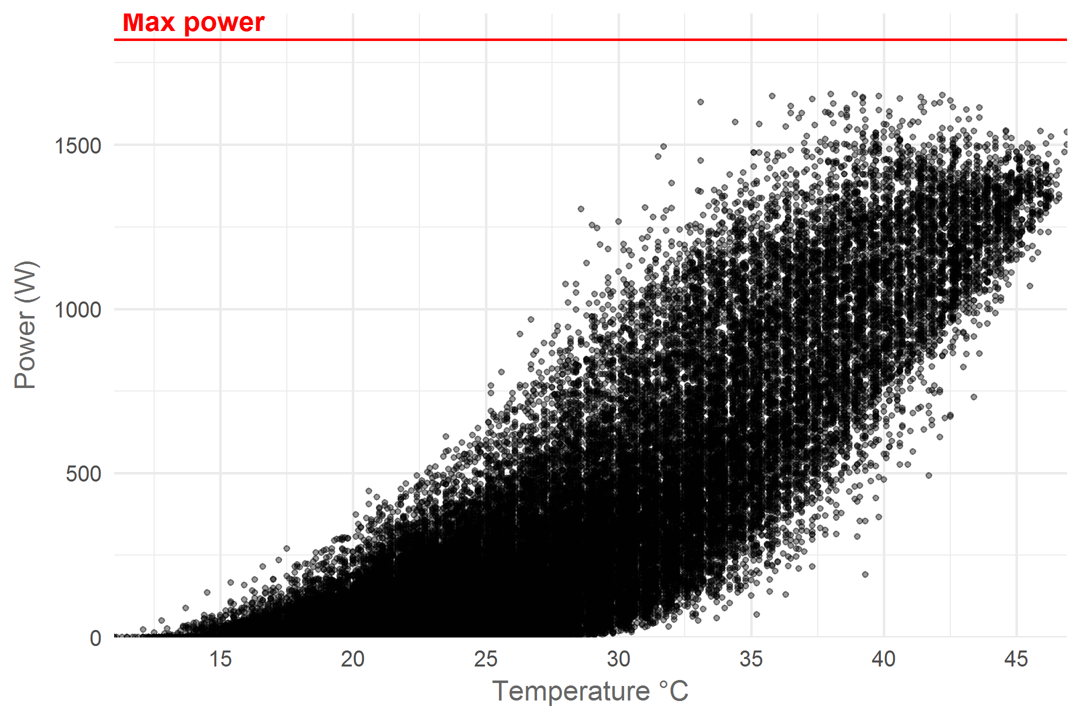
We see a broad range of power - temperature combinations and a clear positive correlation. The negative temperature effect only seems to emerge in the upper right of the graph where the highest power yields are not observed for the hottest temperatures. The broad variance in power yield for any given temperature can be explained by different levels of cloudiness and ambient temperature. In Belgium more than often weather conditions are sub-optimal for photovoltaic installations and this is what we see in the graph. However, we can focus on optimal conditions by looking at the upper edge of the point cloud. These points resemble situations with the highest measured power yield for any given temperature. Let’s draw a line to highlight this pattern:
# a new dataframe with maximal power per temperature
max_p_per_t <- solar_df%>%
  group_by(temperature)%>%
  summarise(power = max(power))%>%
  group_by(rounded_temperature = round(temperature))%>%
  mutate(max_power = max(power))%>%
  ungroup()

solar_df%>%
  ggplot(aes(x = temperature, y = power))+
  geom_hline(yintercept = 1820, color = 'red')+
  annotate("text", x = 14, y = 1880,
         label = "Max power", color = "red", fontface = 'bold')+
  geom_smooth(data = max_p_per_t, aes(y = max_power), se = F)+
  geom_point(alpha = 0.4, size = rel(0.8)) +
  scale_x_continuous(expand = c(0, 0), breaks = seq(0, 50, 5))+
  scale_y_continuous(expand = c(0, 0), limits = c(0, 1900))+
  labs(y = "Power (W)",
       x = "Temperature °C")+
  theme_minimal()+
  theme(text = element_text(colour = "grey40"))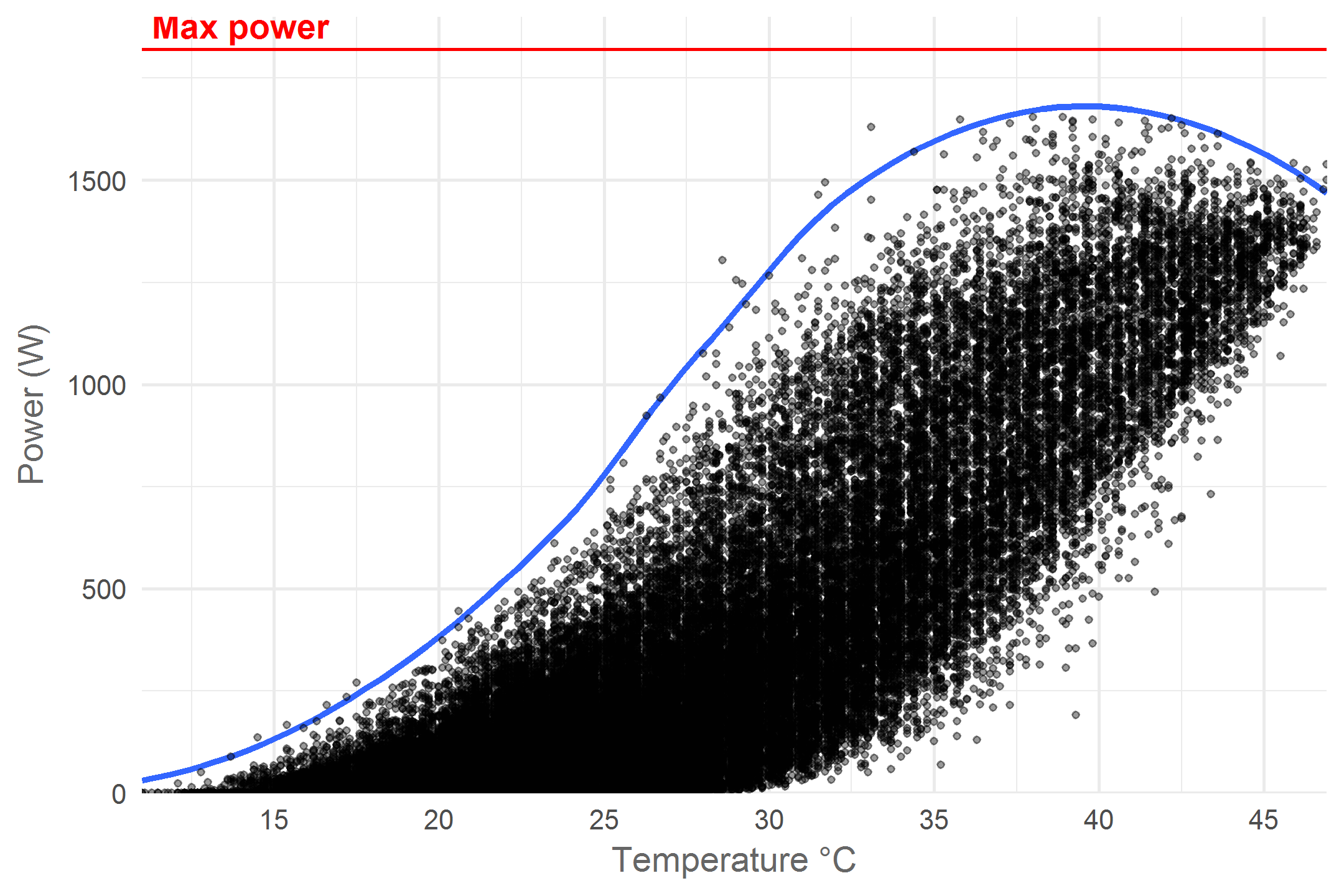
Now the pattern really clears up! As temperature increases the maximum power yield first increases exponentially until about 22°C, then linearly untill 31°C at which point the increase starts to slow down and turns into a decrease at 39°C. According to the manufacturer, temperature starts having a negative effect at 25°C. What is interesting is that at this temperature the highest measured power yield is only 750 Watts. All power yields above 750 Watts occur at higher temperatures where efficiency is sub-optimal. This implies that the installations maximal yield of 1820 Watts can never be achieved in naturally occurring conditions. Another interesting pattern is the exponential increase at low temperatures. My guess is that faint light during cool mornings and evenings is behind this. At low solar elevations (the Sun’s angle towards the horizon) the light rays travel trough earth’s atmosphere for a longer distance which weakens them. In addition the sharp angle of arrival on the panels causes them to spread out more. Let’s explore this idea for a bit.
The effect of solar elevation
The elevation of the Sun is an important factor affecting both power yield and panel temperature. It would be nice if we could add this information to our data set. After all, the elevation of the Sun is quite predictable for each point in time and we have the time dimension in our data set. Turns out the maptools package has an awesome function that will do just that. To get a detailed solar elevation data set we’ll feed the solarpos function my hometown coordinates and 10 minute time blocks for a whole year.
library(maptools)
library(sp)
# My home coordinates, needed to calculate the solar elevation
home_coords <- sp::SpatialPoints(matrix(c(4.401168, 51.220305), nrow=1),
                                 proj4string=sp::CRS("+proj=longlat +datum=WGS84"))

# create a dataframe with 10 minute time intervals for a whole year
solar_position_df <- tibble(timestamp = seq(from = ymd_hms("1970-01-01 00:00:00", tz = "UTC"),
                                            to = ymd_hms("1970-12-31 23:50:00", tz = "UTC"),
                                            by = '10 min'))%>%
  # calculate the solar position for each timestamp at my home coordinates
  # the solarpos function from the maptools package returns a list with 2 elements
  # 1 = the solar azimuth angle (degrees from North), 2 = the solar elevation
  mutate(solar_elevation = solarpos(home_coords, timestamp)[,2])%>%
  # we only care about solar elevations > 0 (daytime)
  filter(solar_elevation > 0)%>%
  # The solar panel dataframe uses UTC + 1h
  # so lets set this data up the same way
  mutate(timestamp = timestamp + 3600)

kable(tail(solar_position_df), align = 'c', format = 'html')| timestamp | solar_elevation |
|---|---|
| 1970-12-31 15:50:00 | 5.496704 |
| 1970-12-31 16:00:00 | 4.461112 |
| 1970-12-31 16:10:00 | 3.398845 |
| 1970-12-31 16:20:00 | 2.317971 |
| 1970-12-31 16:30:00 | 1.236129 |
| 1970-12-31 16:40:00 | 0.182853 |
Now that we have the solar position per 10 minutes for a whole year let’s join these positions to our data and update our plot.
# create a palette to match the Sun's colours
solar_palette <- rev(RColorBrewer::brewer.pal(9, "YlOrRd")[2:8])
solar_df%>%
# make sure all timestamps are properly rounded
mutate(timestamp = round_date(timestamp, unit = "10 minutes"))%>%
# standardise the time to 1970 to allow joing the solar position dataset
mutate(timestamp_basic = lubridate::origin + (yday(timestamp) - 1) * 3600 * 24 +
hour(timestamp) * 3600 + minute(timestamp) * 60)%>%
inner_join(solar_position_df, by = c("timestamp_basic" = "timestamp"))%>%
ggplot(aes(x = temperature, y = power, colour = solar_elevation))+
# apply slight horizontal jitter destroy vertical bands caused by rounded values
geom_jitter(alpha = 0.7, size = rel(0.8), height = 0, width = 0.1) +
scale_colour_gradientn(colors = solar_palette,
breaks = seq(10, 60, 10),
labels = paste0(seq(10, 60, 10), "°"),
name = "Solar\nelevation")+
scale_x_continuous(breaks = seq(0, 50, 5))+
scale_y_continuous(expand = c(0, 0))+
labs(y = "Power (W)",
x = "Temperature °C")+
theme_minimal()+
theme(text = element_text(colour = "grey40"),
legend.justification = 'top')+
guides(colour = guide_legend(title.position = "top", reverse = T,
ncol = 1, override.aes = list(size = rel(5))))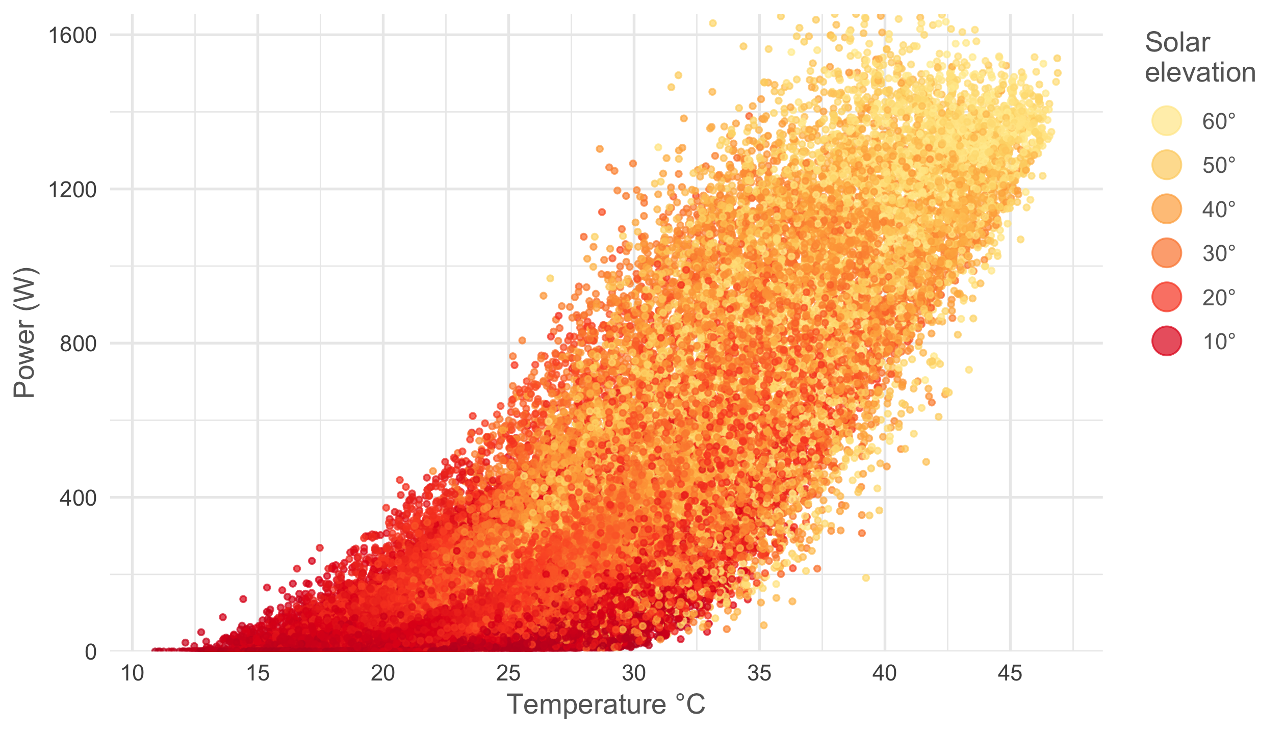 Pretty cool right? As predicted the exponential increase in power at cool temperatures happens at low solar elevations and high power yield + high temperature situations arise when solar elevation is maximal.
Efficiency vs temperature
It would be interesting to have a percentage that tells us how efficient the panels are for each given temperature. For temperatures below 31°C we can assume that the efficiency will be 100% but to calculate this number for hotter temperatures we need to guess how the maximal power would have changed if temperature was not an issue. For this exercise I’ve chosen to make an estimated guess on what this function could look like using the ns function from the splines package.
library(splines)

# get 4 natural splines that match the dimensions of our max power dataset
natural_splines <- ns(max_p_per_t$temperature, 4)[1:nrow(max_p_per_t),]%>%
   as_tibble()%>%
   setNames(c('ns1', 'ns2', 'ns3', 'ns4'))

# train a linear model to match the smoothed maximum power using the splines.
smoothed_lm <- lm(max_p_per_t$max_power ~
                     natural_splines$ns1 +
                     natural_splines$ns2 +
                     natural_splines$ns3 +
                     natural_splines$ns4)

data_and_prediction <- max_p_per_t%>%
  mutate(# predict the measured max power smoothed values
         smoothed_power = predict.lm(smoothed_lm, newdata = .),
         # predict the estimated max power without temperature effects
         # using coefficients obtained trough visual trial & error
         smoother_max_power =  45.58 +
                               1095.05 * natural_splines$ns1 +
                               1778.42 * natural_splines$ns2 +
                               1915.77 * natural_splines$ns3 +
                               1690.02 * natural_splines$ns4)
Let’s plot both the measured and estimated values for all temperatures to get an overview.
data_and_prediction%>%
# set al columns as numeric to avoid issue with gather function
mutate_all(funs(as.numeric)) %>%
# switch to long, tidy format
gather(key = model, value = power_prediction, smoothed_power:smoother_max_power)%>%
# transform to factor to determine the order
# of the legend and fix the labels
mutate(model = factor(model,
levels = c("smoother_max_power",
"smoothed_power"),
labels = c("Max power\nestimation",
"Actual (smoothed)\nmaximum power")))%>%
ggplot(aes(x = temperature, y = power_prediction, colour = model))+
geom_ribbon(data = data_and_prediction,
aes(ymin = smoothed_power, y = smoothed_power,
ymax = smoother_max_power),
colour = NA, fill = 'grey', y = NULL, alpha = 0.4)+
geom_line()+
annotate("text", x = 43, y = 1750, label = "Power loss",
color = "grey10", fontface = 'bold')+
scale_x_continuous(breaks = seq(0, 50, 5), expand = c(0, 0))+
scale_y_continuous(expand = c(0, 0), limits = c(0, 1900))+
scale_color_manual(values = c("Max power\nestimation" = "purple",
"Actual (smoothed)\nmaximum power" = "blue"))+
labs(y = "Power (W)",
x = "Temperature °C")+
theme_minimal()+
theme(text = element_text(colour = "grey40"),
panel.grid.minor = element_blank(),
legend.justification = 'top')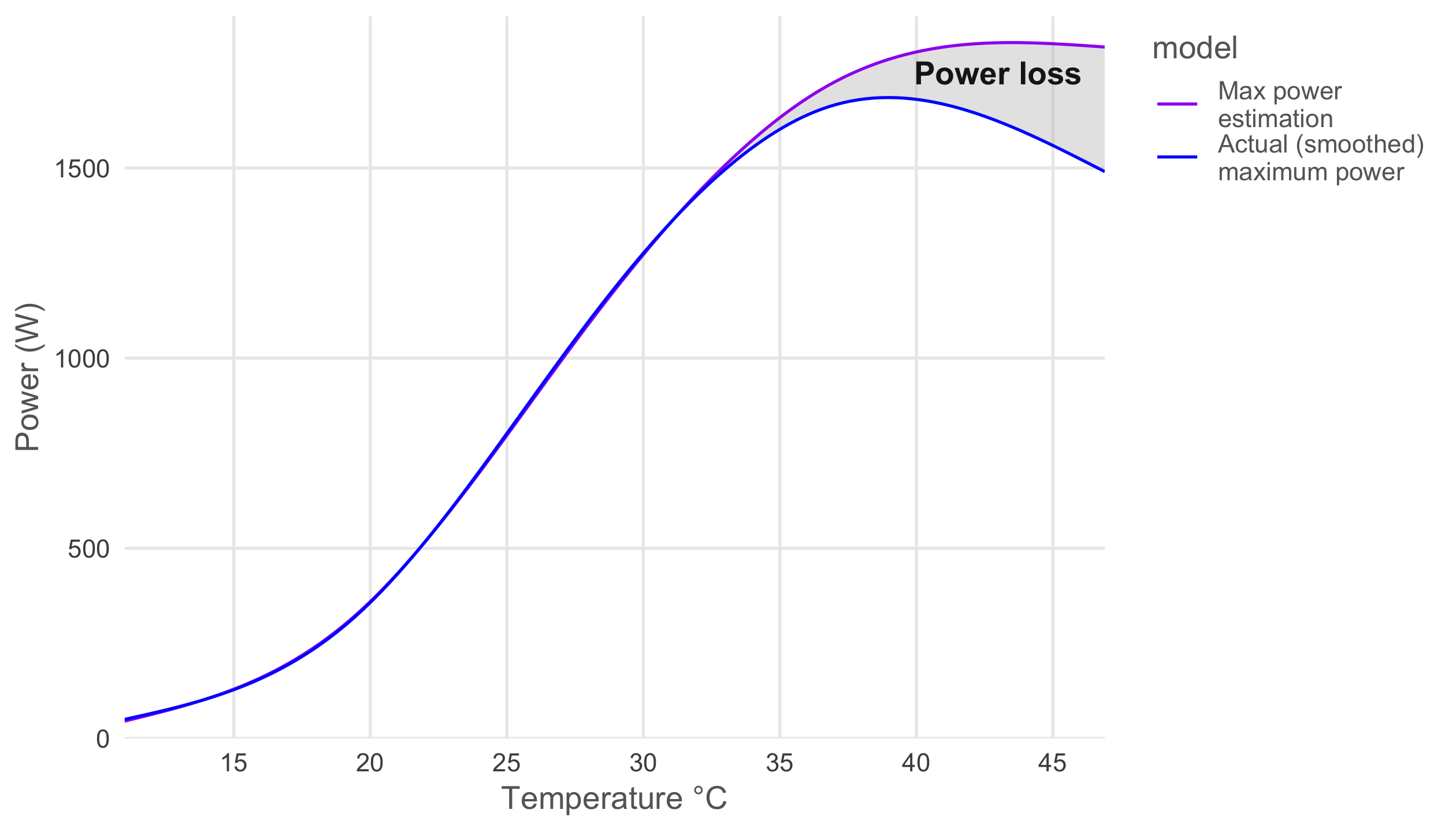 We can nicely see the growing power loss due to temperature as the panels heat up.
We are now all set to calculate an efficiency estimate for each temperature and compare it to the manufacturer’s claim, all we need to do is divide the measured maximum power with the estimated maximum power. Let’s put these results in a new dataframe and plot them.
temperature_and_efficiency <- data_and_prediction%>%
mutate(efficiency_estimate = smoothed_power / smoother_max_power)%>%
select(temperature, efficiency_estimate)%>%
mutate(efficiency_estimate = ifelse(temperature < 31, 1, efficiency_estimate),
efficiency_claimed = ifelse(temperature < 25,
1,
(1 - (temperature - 25) * 0.00408)))
temperature_and_efficiency%>%
gather(key = efficiency_type, value = efficiency,
efficiency_estimate, efficiency_claimed)%>%
mutate(efficiency_type = factor(efficiency_type,
levels = c("efficiency_claimed",
"efficiency_estimate"),
labels = c("Claimed",
"Estimated")))%>%
ggplot(aes(x = temperature, y = efficiency, linetype = efficiency_type))+
geom_line()+
scale_x_continuous(expand = c(0, 0), breaks = seq(0, 50, 5))+
scale_y_continuous(expand = c(0, 0), labels = scales::percent)+
labs(y = "Efficiency",
x = "Temperature °C",
linetype = "Efficiency")+
theme_minimal()+
theme(text = element_text(colour = "grey40"),
panel.grid.minor = element_blank(),
legend.justification = 'top')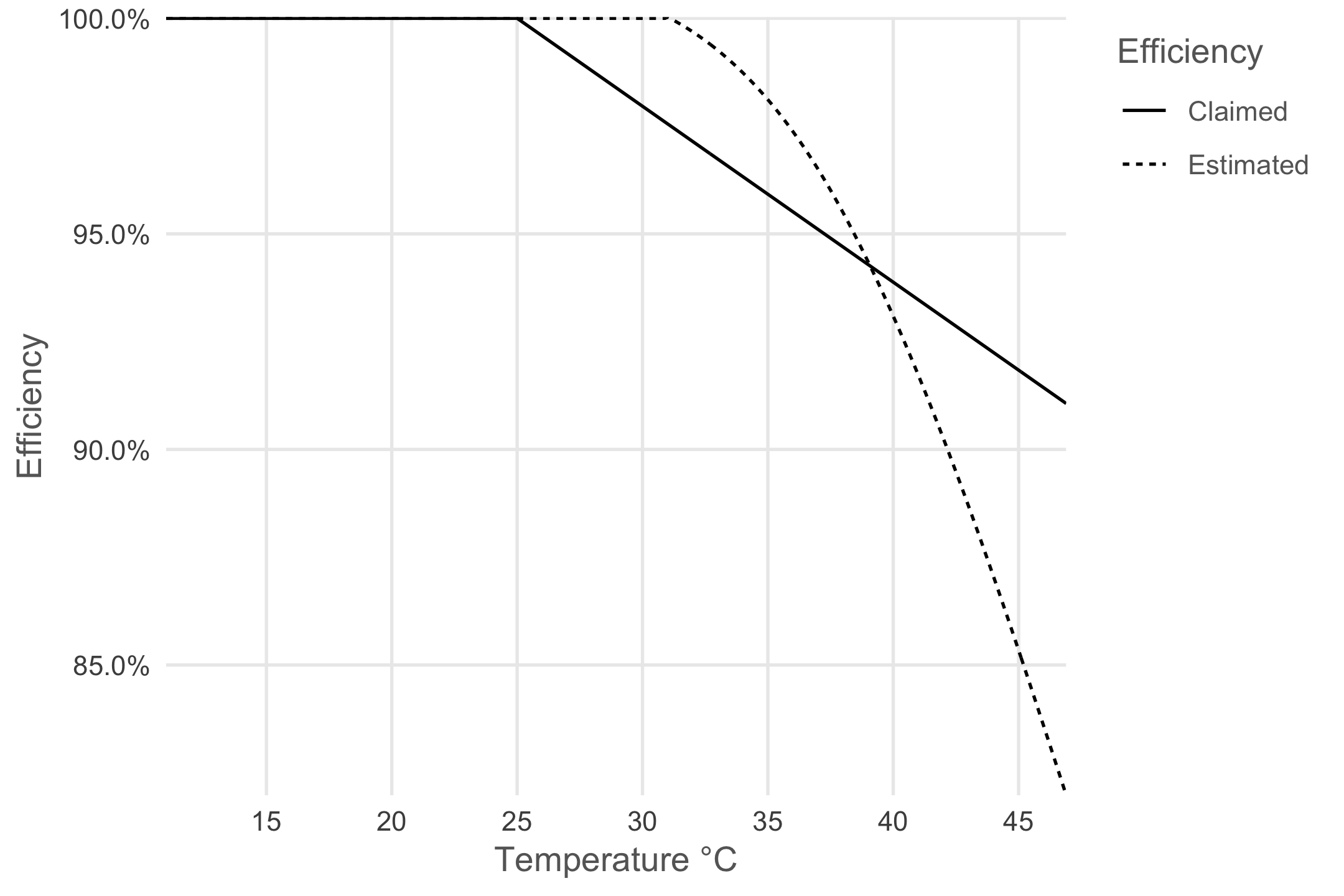 While the manufacturer claims a linear loss in efficiency past 25°C (perhaps for simplicity’s sake) we find a non-linear relation. Below 39° the manufacturer predicts worse efficiency than I do but for hotter temperatures I estimate a stronger negative effect.
By joining the efficiency per temperature back to our raw data set we can visualize when the negative effect of temperature on efficiency is most important. While doing so we do assume that the negative effect of temperature is the same for all power yields at that temperature. For example at 42°C we get a 10% reduction in power and we assume this both holds while producing 1500 or 500 Watts.
library(RColorBrewer)
solar_df%>%
mutate(hour = hour(timestamp) + minute(timestamp) / 60,
month = month(timestamp, label = T, abbr = F))%>%
# add the efficiency values to each temperature
inner_join(temperature_and_efficiency, by = 'temperature')%>%
ggplot(aes(x = hour, y = power, colour = efficiency_estimate)) +
geom_point(alpha = 0.6, size = rel(0.8)) +
facet_wrap(~month) +
scale_colour_gradientn(colors = brewer.pal(9, "RdYlGn"),
name = 'Efficiency',
labels = scales::percent) +
labs(x = 'Hour of the day',
y = 'Power (W)') +
theme_minimal() +
theme(text = element_text(colour = "grey40"),
strip.text.x = element_text(colour = "grey40"),
legend.position = 'top',
legend.justification = 'left')+
guides(colour = guide_legend(title.position = "top", nrow = 1,
override.aes = list(size = rel(3))))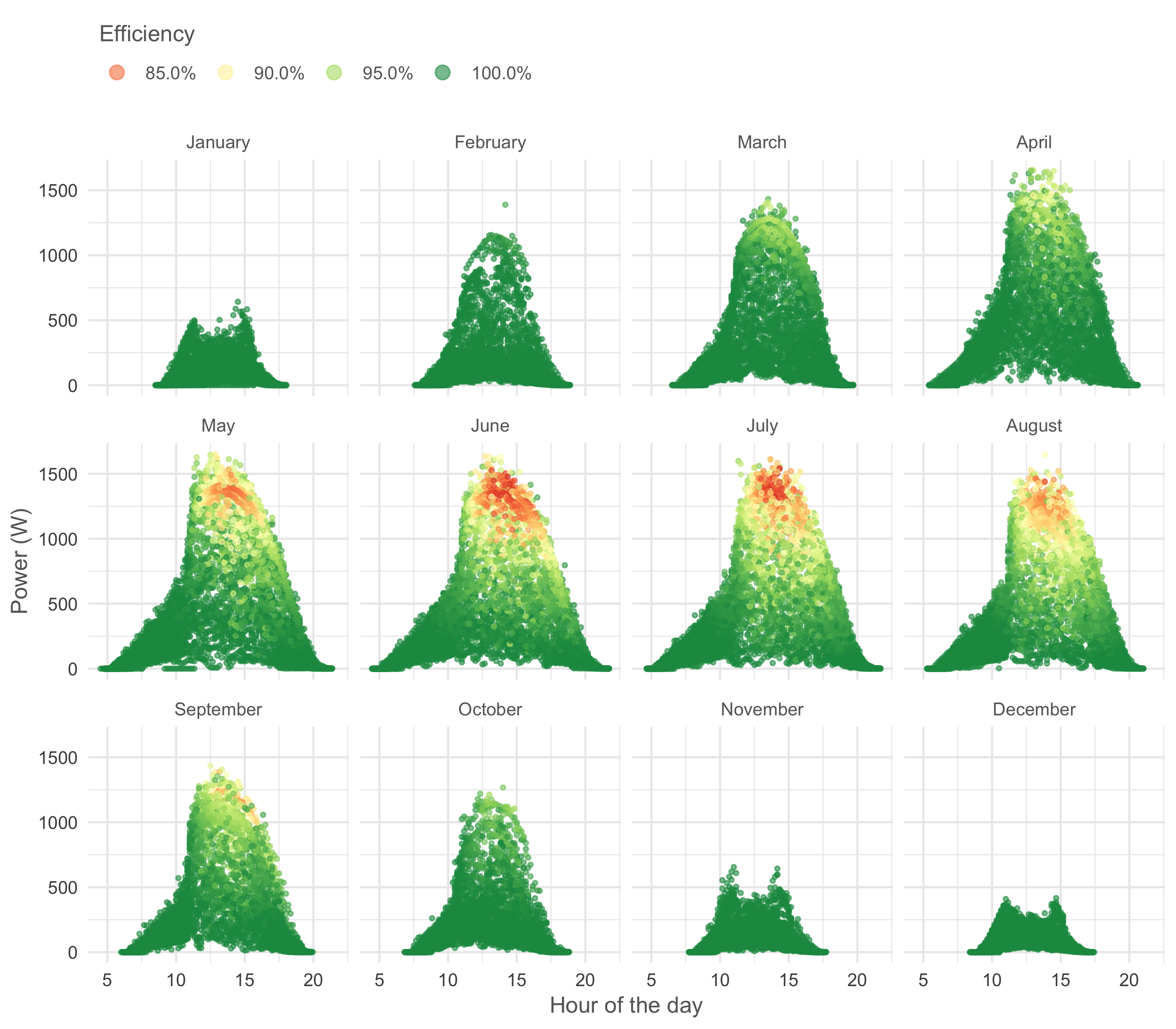 It is clear that from May to August the panels suffer from heat around noon when there are no clouds. In March and April, when the air is still cool, efficiency remains high even at noon which results in high power yields despite the Sun’s limited elevation in these months.
Finally, let’s look at the percentage of power lost due to heat per month to get a more precise idea how important the effect is overall.
solar_df%>%
  # add the efficiency values to each temperature
  inner_join(temperature_and_efficiency, by = 'temperature')%>%
  mutate(potential_power = power / efficiency_estimate)%>%
  group_by(month = month(timestamp, label = T))%>%
  summarise(total_potential = sum(potential_power),
            total_actual = sum(power))%>%
  mutate(pct_efficiency = total_actual / total_potential,
         overall_pct_efficiency = sum(total_actual) / sum(total_potential))%>%
  ggplot(aes(x = month, y = pct_efficiency,
             # trick to make ggplot understand that
             #all months belong to 1 group
             group = overall_pct_efficiency))+
  geom_line()+
  geom_hline(aes(yintercept = overall_pct_efficiency), colour = 'grey40', linetype = "dashed")+
  geom_point()+
  annotate("text", x = month(2, label = T), y = 0.9675,
           label = "Whole year average", color = "grey40", fontface = 'bold')+
  scale_y_continuous(labels = scales::percent)+
  scale_x_discrete(expand = c(0.08, 0.08))+
  labs(y = "Efficiency (estimate)")+
  theme_minimal() +
  theme(text = element_text(colour = "grey40"),
        axis.title.x = element_blank())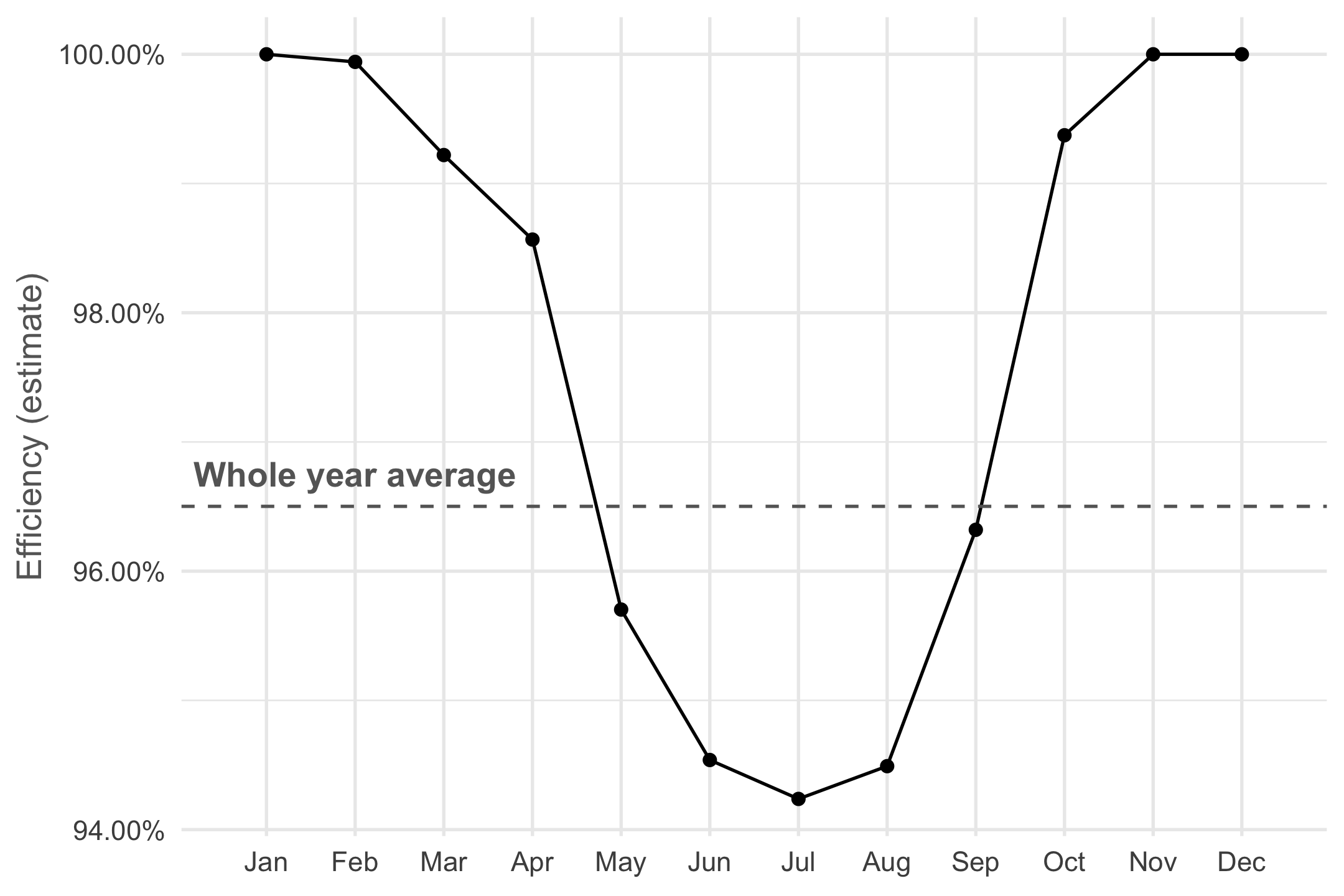
In June, July and August panels lose up to almost 6% in power due to heat, and over the whole year we lose about 3.5%. This is does not sound too bad but do note that these panels are located in Belgium, a country not exactly known for it’s tropical temperatures or scorching sunlight. In the regions most interesting for photo-voltaic plants the efficiency loss will be more important.